

Subdue: Subscription Management Dashboard
problem
With media, software, apps, games, and more using a subscription model, it can be difficult to keep track of all of the subscriptions we pay each month. We may continue to pay for products or services we no longer use because we don’t even know what we’re paying for. I was presented with a company that offers a product to keep track of subscription fees. The project brief included wireframes of a desktop version of the product, but the current website is not mobile-friendly.
solution
For this project, I created a high-fidelity prototype of a subscription management app. My work in this process included:
Creating a company name and visual style
Conducting secondary research
Creating and administering a survey
Producing user flows
Creating sketches
Creating low-fidelity designs
Conducting usability testing
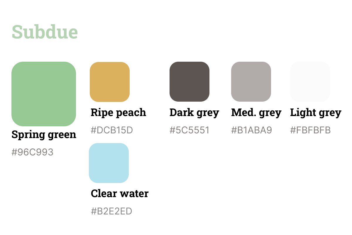
Company Name & Visual Style
My first step was to create an identity for the company.
I chose the name “Subdue” for the company name as a portmanteau of “sub” and “due” with the clear association of an app that helps you to manage money. Additionally, the definition of “subdue” of “overcome, quieten, or bring under control” also serves to bring associations of bringing better control over subscriptions and finances.
The project brief listed brand attributes of trustworthy, caring, friendly and casual. The brand personality is a trusted friend who is helping you save money. I chose brand colors to fit the casual, friendly brand that were not too bright to bring a subdued user experience.

secondary research
To create an app version of the current web-based product, I began the process with secondary research on subscription spending and management. I also looked at user reviews of leading industry products Trackmysubs, Trim, and Truebill (rebranded as Rocket Money during research). The purpose of this research was to gain insight on what app features would be most beneficial to users.
NOTABLE RESEARCH FINDINGS
Americans underestimate how much they spend on subscriptions. One study found that while respondents stated paying an average of $86 per month, the actual figure is over $200.
According to Deloitte’s 2022 Media Trends report, people are most likely to cancel streaming subscriptions due to pricing and lack of fresh content.
USER REVIEWS OF INDUSTRY LEADERS
Pros highlighted by users
Being able to set up alerts for when a subscription is due
Easy layout
Ability to track multiple types of subscriptions
Can cancel automated subscriptions through app
Provides insights into spending habits
Easy drop down menus
Cons highlighted by users
No fast way to filter tags
No app available for Trim
Not fond of color scheme on Rocket Money (purple to red gradient)
No calendar picker for dates
User Survey Results
A total of 22 respondents filled out the survey.
Notable findings
73.6% of users have 2-10 subscriptions
Most common types of subscriptions: Video streaming, music streaming, and games
Most common reasons to cancel a subscription: No longer using the service, a cost increase
Many respondents stated they do not manage their subscriptions
While respondents listed a variety of ways they track their subscriptions, the most common response related to using their phones, through notifications or the settings within individual apps
Respondants also cited managing subscriptions through money tracking apps, credit card bills, and bank accounts
user flows
I created user flows to accomplish these user stories:
As a current user, I want to see all of my subscriptions in one place so that I can get a comprehensive view of my spending on subscriptions
As a returning user, I want to unsubscribe from a subscription so that I can reduce needless spending
As a consumer, I want to be notified if any of my subscriptions are about to be auto-renewed so that I can make a decision about if I want to renew the subscription and continue spending money

sketches
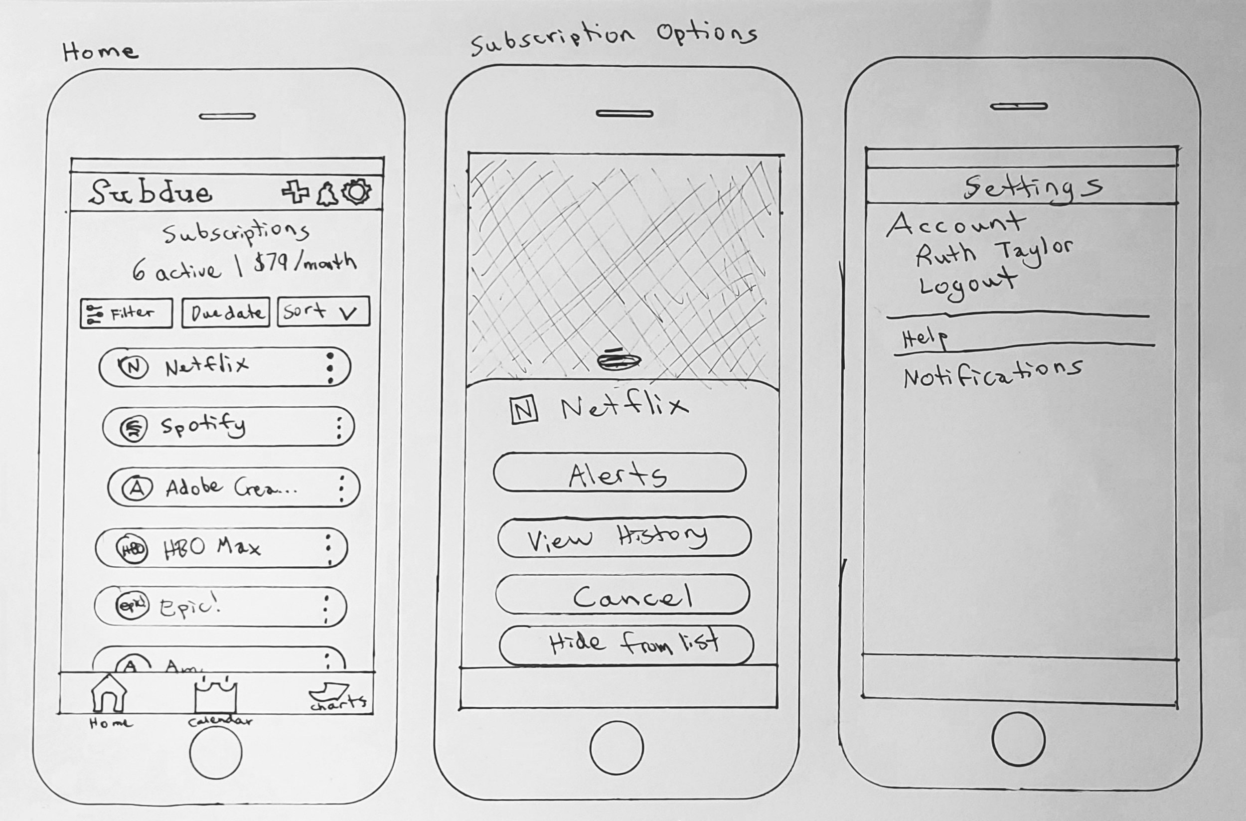
Using these user flows, I began sketching out solutions.
wireframes

view and sort subscriptions
add a subscription

cancel a subscription

add an alert - through alerts menu
add an alert - through subscription options menu

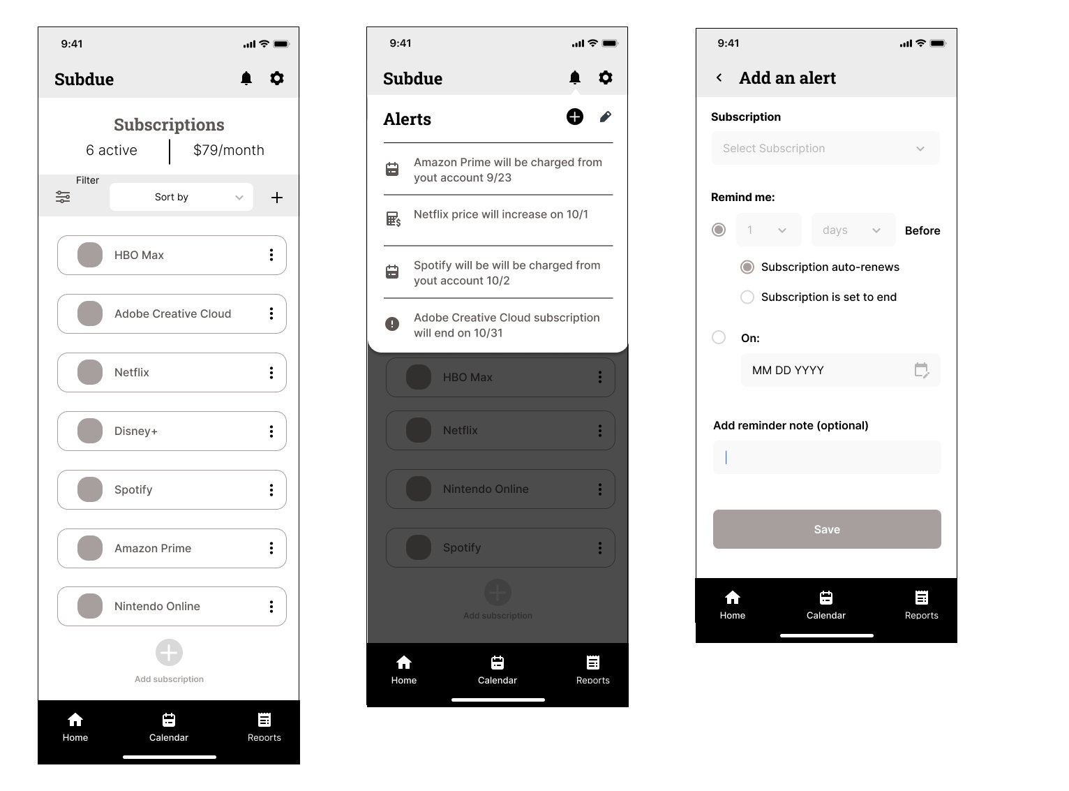
Low-fidelity Usability Testing
I conducted moderated remote usability testing with five users, recruiting participants age 30 and older to meet the user profile for the product. The purpose of usability testing was to identify if the app is usable in its current state and what improvements should be made.
top issues uncovered
The dollar amount listed at the top of the Home screen is ambiguous.
Sorting options are unclear.
After canceling a subscription, the subscription still displays the same in the dashboard.
Specific objectives
Is the Home screen understanstandable for new users?
Can participants easily add a new subscription?
Can participants set reminders? Where in the app would they go to do that?
Will participants be able to easily cancel a subscription?
How will participants look for specific information about a subscription?
Is there any other information they would want to see in an app for subscription management?

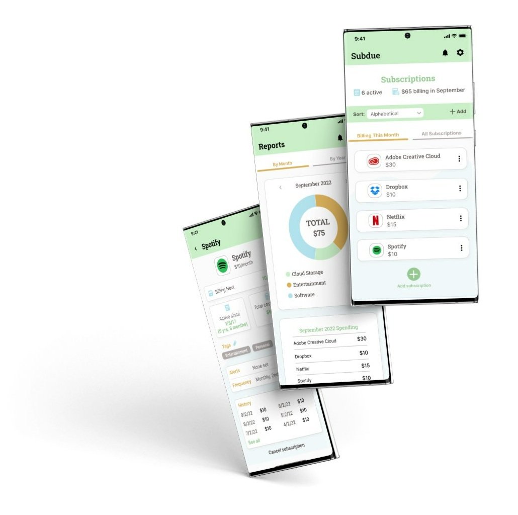
high-fidelity designs
I incorporated the visual style I created for Subdue to create high-fidelity designs for the app.


I conducted the second round of usability testing using the high-fidelity designs. I sought to ensure the app is usable with five new users as well as determine if the screens added since the first round of testing (Calendar and Reports) are understandable.
important findings
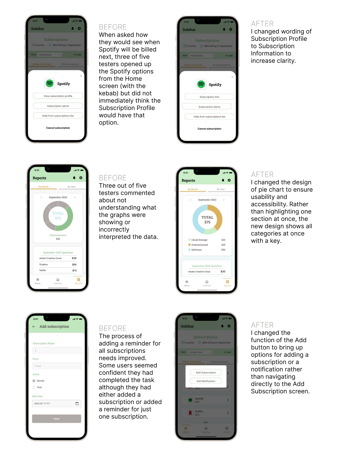
It is unclear what information will be found in the subscription profile.
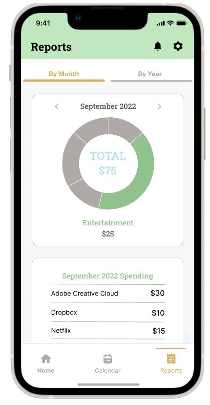
The information displayed in the charts on the Reports screen is unclear.
The process of adding a reminder for all subscriptions needs improved.
The results of this round of testing led to minor yet important changes.
High-Fidelity Usability Testing
final thoughts
Transforming a large amount of data and numbers into an app that is simple and enjoyable to use required some work to get it right, and there is still more that could be added and improved. Overall, the feedback of the testers is that the product has the features they would want in an app like this, and the visual design enhances the experience.
Additional features I would consider adding beyond the minimum viable product:
The ability to see which subscriptions are used least often to help users make decisions about whether to cancel them.
A way to indicate which subscriptions are for other members of the household (such as a child) and easily transfer those subscriptions to that person if they take over payments for them.

