

Biq: Life-optimization app

problem
Behavioral Intelligence® Experts provide clients with tools and coaching to help them be at their best. They focus on stress management, goals, decision making, action and accountability for improved performance and productivity.
Although the client’s methods had been proven to lead to results, using The STARR Process© in the form of a mobile app is a new venture for them. They wanted an app that would allow users to use The STARR Process© to accomplish their goals. The client had an existing Figma file of some designs of screens, but the UI had not been fully developed. The app also had never gone through any usability testing. Working with two other UX/UI designers, we were tasked with taking what had been created and leveling it up to a more intuitive, engaging platform.
solution
Through a four-week process of competitor analysis, usability testing, design iterations, and further usability testing, my colleagues and I were able to improve functionality and usability of the BiQ app. The end result is an app that makes sense to users and one they can see value in using.
My work on the project included:
Creating a clickable prototype in Figma to allow engaging usability testing
Conducting usability testing with three participants
Sketching solutions
Iteration of high-fidelity designs

first steps
Before making any changes to the existing design, my team wanted to conduct usability testing to get feedback on what was working, what needed to be improved, and what users would actually want in this unique type of app. While my colleagues worked on competitor analysis and writing a script for usability testing, I created a clickable prototype of the existing Figma file.
Without any connections between screens in the Figma file, I had to talk with the client about how users were supposed to move through the app. In some cases, she didn’t know why an element had been created. I spent time learning about the information in other resources the client provided in order to think through the best ways to translate that knowledge into an app.

usability testing
To test the product in its current state, we conducted usability testing with six participants meeting the client’s target user of professionals ages 25-60. Each of the three designers did remote usability testing with two testers.
Questions we wanted to answer through usability testing were:
Can users move easily through the app?
Will users be enticed to use call to action buttons and pay for premium content?
How much are users willing to pay for STARR report and/or subscription service?
Findings
Usability testing revealed issues with the prototype in its current state and set the priorities for what changes to make to the app. Some of the most significant issues revealed were:
Testing participants were confused by how to move through the STARR Process©. Although the steps of Stop, Think, Assess, Respond, and Review are meant to be done in order, not all testers understood this from the way the information was presented in the app.
It isn’t clear what tasks users are supposed to complete on the steps of the STARR Process©, particularly with the Think and Respond screens. Testing participants spent a lot of time looking at these screens and were confused about how to proceed.
The pop-up screen that appears when users click on parts of the app that are paid content is difficult to read and does not entice users to pay for those features. Additionally, some testing participants had a negative opinion of it not being clear upfront that they will have to pay to unlock some features of the app.
New users need more information about what the STARR Journey is and how using the BiQ app will benefit them.
Two testing participants commented that the word Stop and the red hand were off-putting and did not seem like a starting point.

My colleagues and I began working on solutions to improve different aspects of the user experience. I set out to create a more clear path of how to move through the STARR Journey using numbers and arrows. Once I had a clear interface in mind, I revised three of the high-fidelity designs in FIgma with those changes.

Sketching
New high-fidelity designs
before

after

To create the second version of the STARR Journey screen, I made several changes:
Revised the introductory screen of the STARR Journey to show the sequence of how users are meant to move through the screens
Added a “Next” button at the bottom so that users will be more likely to start with the first step of the process rather than clicking on one of the subsequent steps.
Removed elements that did not belong on the screen
before

after

To improve the user experience through the STARR Process© I also modified the Stop and Think screens:
Added a bar at the top to show where users are in the STARR journey. The current step is highlighted with color, and users can click the other letters to easily move to a different screen
Modified the “Back” and “Next” buttons at the bottom to make it clear to the user that these are clickable elements
Modified the appearance of the call to action buttons for unlocking prime content to be consistent from screen to screen with a rainbow stroke
Removed the bottom navigation bar as it isn’t needed during this flow and users can use the back button to return Home
Added a button users can click to learn more about each step of the process and created screens that show a few paragraphs of information about each step
My colleagues then applied these elements to the other screens of the STARR Process©.

before
after


before
after

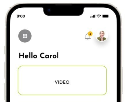
For the top navigation bar, I removed the grey menu button. In the original design, this was planned to be a way to access Settings, FAQ’s, Notifications, Share With Friends, Terms and Conditions, and Contact. As these are not screens users would need to access frequently, they do not need to be on the home screen. Since the navigation bar already displays the user’s profile photo, that seemed like a logical way for users to access their account information and settings. I created Account screen with a gear icon that users can tap on to access settings.
Second round of usability testing
findings
The app still needs more development to become something users see value in using daily. Users seemed to better understand the purpose of the app in this iteration, but users stated they weren’t sure they would use it often.
One user commented on the bright red stop icon being off-putting. As two others made similar comments in the first round of usability testing, it’s possible this element should be redesigned.
Some other UI elements could be improved aesthetically, but comments on this were a matter of personal preference rather than not finding these elements usable in their current state
My colleagues and I conducted a second round of usability testing to validate the changes we made. Testing revealed that while there is still more work to be done, the changes we made improved the user experience. Some of the new testers clicked the “More about this step” button, allowing them to gain further understanding of the purpose of that step.


final thoughts
This project was a new experience for me in many aspects, including developing a real-world product, working on modifying an existing solution rather than starting from scratch, and collaborating with other designers on a UX project. My team spent a lot of time at the beginning trying to understand the product and what had been created, a good lesson in the importance of providing documentation on what has been done and what is left to do. While we were able to provide the client with some answers about what users would want in the app and what could be improved, questions still remain.
Still to be determined
What screens should be included in the bottom navigation bar? This was a part of the UI my team and I did not change. In its current state, all the buttons lead to content that only users who have paid for the app can access. With a free account, all icons other than Home bring up a pop-up prompting them to upgrade to a paid account. Is this something that will incentivize users to upgrade or cause them to become frustarated and stop using the app?
How can the app provide content that keeps users coming back? What will motivate them to use the app regularly? One usability testing participant, when asked how often he thought he would use the app stated, “How often should I and how often would I are probably two different things.”
What is the best way to educate new users about BiQ and the STARR Process©? While the information my team added to the onboarding screens and in the “More about this step” screens helps give new users gain understanding about the process, the second round of usability testing revealed users still need to know more to fully understand how the app could help them.